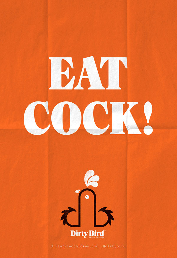
Take a long, hard look at this design and tell me what you see. Is it the innocent image of a rooster, or do you get a throbbing feeling that the designer had something a little more phallic in mind? That’s the source of the blowback directed at catering company Dirty Bird Fried Chicken for their controversial new logo.
According to graphic artist Mark James, the man behind the cockerel, the image is nothing more than a barnyard bird.
“We were given the name Dirty Bird as the brief, and started working on ideas. We looked at the initials, DB. Then worked with the lowercase ‘db’ linking them to form the shape of a rooster. It’s a graphic representation of a rooster incorporating the initials. It depends on how you look at it,” he told the Mirror. “I’m not sure there have been any complaints. A few comments, but it’s in the eye of the beholder, as they say.”
In other words, you only see a penis if you’ve already got one on your mind. Thanks for the sentiment, Dr. Freud.
Dirty Bird owner Neil Young also insists that the rebranding of his Cardiff, Wales food truck was never intended to offend anyone.
“We’ve never really thought about it like that. Our designer created a d and b for ‘dirty bird’ then pushed them together to make a cockerel,” he told the press.
To be fair, the word “cock” technically does mean rooster, but you’d be hard pressed to find one that bears a pure white comb. Explain that, Mr. James.
“It’s not really what you want to think about when you’re tucking into your meal,” wrote an anonymous patron.
But with giant, juicy posters telling customers to “Touch My Breast” and “Eat Cock!,” it’s hard to take the shocked reactions of James and Young seriously. If you’re eating at a restaurant called Dirty Bird, don’t act surprised if get a little meat with your order.
Know of any other questionable campaigns? Let us know in the comments.
Tags : 2014, buzzworthy, cock, dirty bird, fried chicken, Humor, life, logo, new, The Scene, Wales

Subscribe. Follow. Like.
To RSS Feed
Followers
Fans