


Introduction
The relationship between designers and developers can be tenuous. Designers spend hours on pixel-perfect visuals and crisp micro-interactions, striving to give users power and simplicity at the same time. Designers often cannot see the complexity of what they are asking for, but developers are forced to deal with that complexity; the edge cases that a lovely and idealized image cannot capture. They must deal with situations where a user has found a way to thwart the system, where data is overwhelming and unruly, where that simple design must scale to millions of users.
The root causes of failing to understand the complexity in a design are many, but a large cause is that designers spend too much time focusing on an ideal state. How can we encourage designers to think through these states, in turn improving developer-design relations? How can designers deliver their solutions in a format that is understandable and consumable by developers, and in turn deliver a delightful and thoughtful experience for the user?
A tricky problem
For capturing detailed interaction notes, no method has won universal acceptance. Face-to-face conversations, sticky notes, meetings, sketches, wiki pages… they all become vehicles for redefining how the system should work. This sad history has left many a developer and designer despondent: where is the final source of truth? What will be built in the end?
Expressing visual design requirements, however, is a solved problem: developers are now used to, and may even request, a “red-line.” This term, coming from legal documentation where a contract may be marked up in red pen with changes by opposing counsel, represents red text in design that contains detailed visual notes for developers with requirements in pixel and hex color values across a design. The color red is chosen for these notes because of its stand-out nature against the actual design – it is jarring, and calls attention to the details. It works – these red lines are the best defense against bad interpretation of spacing, alignment, coloration, and the like.
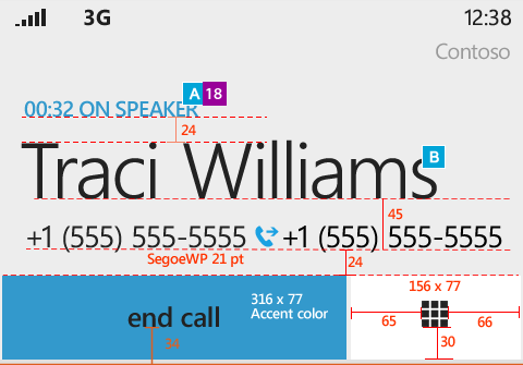
For such an effective system in terms of visual design, why can’t this be applied to interaction design? Where are the “pink lines” – detailed interaction notes written in pink in a consumable fashion? How could a designer get started writing such notes?
My weapon of choice is Adobe Fireworks, as it allows you to quickly create many pages in a single file for different states of the system, with small variations and focus (but opinions vary!). Breaking a design into multiple pages can put focus on an interaction or consumable chunk of work, easily translated into a JIRA issue (or whatever your tracker of choice is) for tracking by a developer. But how do you know when to break something out?
What warrants a pink line
The answer to this question varies greatly by project, but in general it is whatever the smallest chunk that can be broken out without incurring redundant work, losing too much context, or creating dependencies. A few examples:
- Adding a complex UI element, such as a text box that may populate or require dynamic interaction. Defining how this box interacts, the general philosophy of placement and color, how it will populate, ghost text, defaults, limits, error states etc.
- A state of the system that is always required, such as a blank state, loading state, or error state.
- Applying auditing or permissions across a set of screens that requires a great deal of backend work, though may not be present in a design
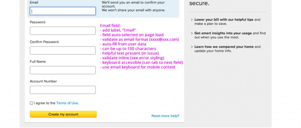
Above we see how something as simple as an email field might warrant nine interaction notes. Each of these pieces of the design may have anywhere from 5-15 pink lines indicating interaction, edge cases, and additional nice to haves. Beyond 15 things start to get lost and hard to interpret – can you break it down a bit more? These screenshots can easily be attached to a JIRA issue and estimated irrespective of other pieces of work. The requirements in the design can aid project and product managers in writing out acceptance criteria.
Writing your pink lines
After you’ve broken out an appropriate chunk of the design, the next step is to write out all the important interactions. In this process it’s important to do a few things:
- Identify the edge cases. Edge cases are users unintentionally (or maliciously) trying to break your lovely design, putting the system in an unusable state. This is especially important if you are dealing with user generated content, which may require truncation in the display or sanitizing if users try to put in unwanted characters into a field.
- Consider the transitions and things you don’t see. Static images are especially bad at conveying transition states and responsivity. What happens if the user opens up additional elements on the screen? What happens if your system is to be optimized for mobile, or responsive? How will keyboard controls work with this system?
- Understand and explain the system. What limitations will the system have when loading in data? Can it load things piecemeal, ajaxily, and give feedback immediately? When should the system refresh data, and which actions the user takes should trigger that refresh? The deeper the understanding of the system, the more benefit you can provide in messaging to the user what is happening and why.
These few concepts will help you get started – but think broadly (and get feedback!). Developers are your best ally in identifying those edges cases and other unknowns (as they’ve seen them all before, and know how painful it will be for them if they guess and get an interaction wrong for stakeholders or the user.)

Conclusion
Whether or not you’d like to provide detailed interactions for developers, those interactions will be built into the system regardless. Design is inevitable, and the designer, at the end of the day, is the person with his or her hands on the keyboard last. Pink lines are both a navigational element on the journey to building a wonderful experience, as well as an olive branch to developers saying you both understand and respect their need to account for all the possible scenarios in the code. Your perfect image is forgiving – code, rarely so.
In the long run, such maps of edge cases can be applied across other parts of the system, patternizing things such as blank and error states. Doing it the right way, and providing guidance once, can speed everyone up on the long run. It can make every state of the system wonderful to experience. Most importantly, your users will thank you for thinking about those little details.
So… get pink!

Tags : Adobe Fireworks, Arts, Atlassian, design, Human-Computer Interaction, JIRA, Miscellaneous, UI, user experience, User interface, UX, WebDev, Websites, Workflow


Subscribe. Follow. Like.
To RSS Feed
Followers
Fans